Episode 146 Show Notes
![]() Episode 146. Do you judge a book by it’s cover? Or even more likely, perhaps you’ve purchased a sake based only on the label? Since we’ve all been there, we thought it might be fun to explore the world of sake labels and share some likes, dislikes and survival tips for navigating your way around a bottle of sake. In particular, learn our technique to read a Japanese sake label “by the numbers”. Whether they are all in Japanese, all graphics or including some english, the sake bottle labels can have a major impact on sales so it is well worth learning more. So, get ready to judge sake bottles by more than just their covers in this episode, as we take you through the ins and outs of understanding whats on the label. #sakerevolution
Episode 146. Do you judge a book by it’s cover? Or even more likely, perhaps you’ve purchased a sake based only on the label? Since we’ve all been there, we thought it might be fun to explore the world of sake labels and share some likes, dislikes and survival tips for navigating your way around a bottle of sake. In particular, learn our technique to read a Japanese sake label “by the numbers”. Whether they are all in Japanese, all graphics or including some english, the sake bottle labels can have a major impact on sales so it is well worth learning more. So, get ready to judge sake bottles by more than just their covers in this episode, as we take you through the ins and outs of understanding whats on the label. #sakerevolution
Skip to: 00:19 Hosts Welcome and Introduction
Welcome to the show from John and Timothy
Skip to: 01:24 Exploring Sake Labels
Sake Labels can be confusing, beautiful, easy-to-read, totally incomprehensible or anything in between. One trick we have discovered to read sake labels without knowing Japanese is to go “by the numbers”. If you understand the parameters of some of the sake stat numbers, it makes it easier to pick out these stats if they are on the label:
Sake Meter Value is usally proceeded by a + or – (eg +2.0, -4.0)
Alcohol is usually a number between 14 to 18 followed by the “degree” kanji (eg 15.5度, 16度)
Acidity is usually a number between 1.0 to 2.0 (eg 1.1, 1.8)
Rice Milling Rate is usually between 40%-70% (eg 55%, 50%)
Bottle Volume is usually 300ml, 720ml or 1.8L depending on the bottle.
Labeling Requirements. There are a number of things that are required on the label in the Japanese Market
1 : Product Name
2 : Producer’s Name
3 : Producer’s Address
4 : Bottle Size Volume
5 : Alcohol Content
6 : Ingredients
7 : Legal Statement on Drinking
Newly Optional on the label: Bottling Date
For Japanese sake imported into the U.S., be sure to check the BACK LABEL to learn more about the sake!
Skip to: 07:00 Sake Label: Suigei Tokubetsu Junmai
 Brewery: Suigei Shuzo
Classification: Tokubetsu Junmai
Acidity: 1.6
Alcohol: 15.5%
Prefecture: Kochi
Seimaibuai: 55%
SMV: +7.0
Rice Type: Akitsuho
Skip to: 16:02 Sake Label: Azakura Junmai Ginjo Omachi
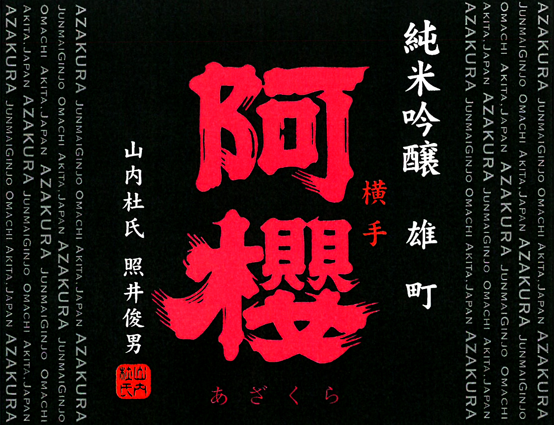 Brewery: Azakura Shuzo
Classification: Junmai Ginjo
Acidity: 1.8
Alcohol: 16.5%
Prefecture: Akita
Seimaibuai: 50%
SMV: 0.0
Rice Type: Omachi
Brand: Azakura
Importer: Mutual Trading (USA)
Skip to: 19:40 Sake Label: Denshu Tokubetsu Junmai
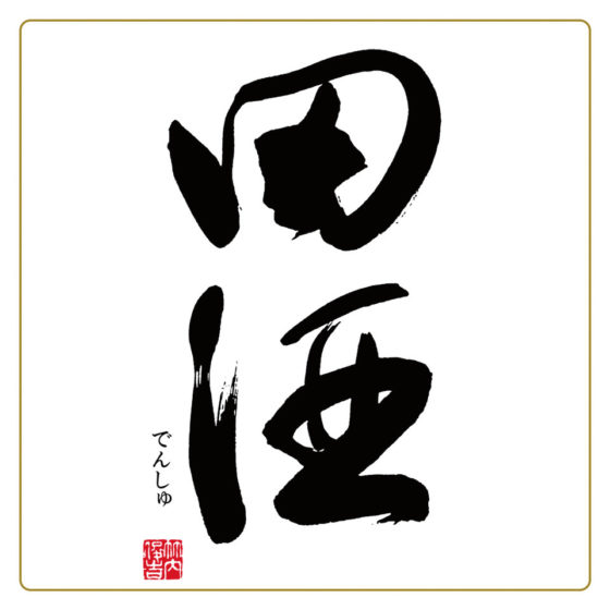 Brewery: Nishida Shuzoten
Classification: Tokubetsu Junmai
Alcohol: 15.6%
Prefecture: Aomori
Rice Type: Hanafubuki
Seimaibuai: 55%
SMV: +3.0
Skip to: 23:52 Sake Label: Wataribune Junmai Ginjo 55
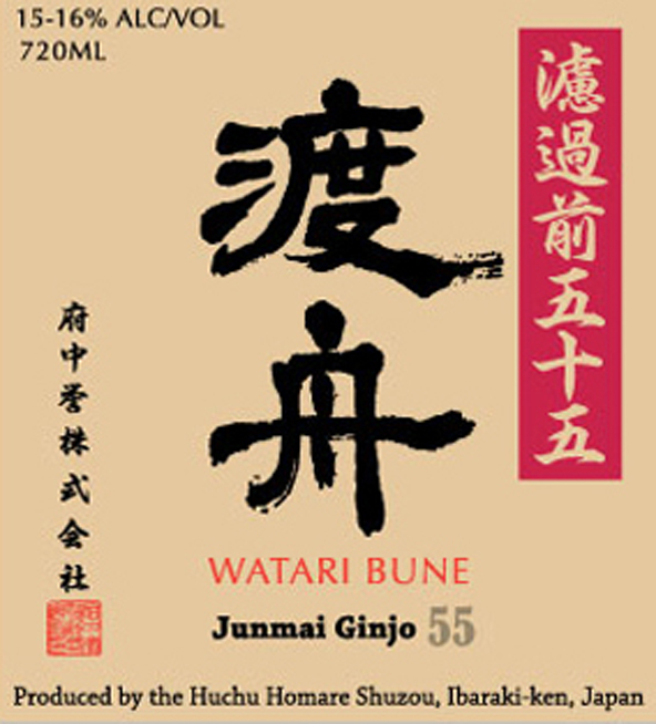 Brewery: Huchu Homare Brewery
Classification: Junmai Ginjo
Acidity: 1.5
Alcohol: 15.5%
Prefecture: Ibaraki
Seimaibuai: 55%
SMV: +3.0
Rice Type: Wataribune
Brand: Wataribune
Importer/Distributor: Joto Sake
Yeast: Kyokai 9
Skip to: 25:57 Sake Introduction and Tasting: Wataribune Junmai Ginjo 55
Wataribune Junmai Ginjo 55
Brewery: Huchu Homare Brewery
Classification: Junmai Ginjo
Acidity: 1.5
Alcohol: 15.5%
Prefecture: Ibaraki
Seimaibuai: 55%
SMV: +3.0
Rice Type: Wataribune
Brand: Wataribune
Importer/Distributor: Joto Sake
Yeast: Kyokai 9
View On UrbanSake.com
NOTE: Use Discount Code “REVOLUTION” for 10% off your first order with Tippsy Sake.
Skip to: 31:12 Show Closing
This is it! Join us next time for another episode of Sake Revolution!
Support us on Patreon
 Now there is a new way to support Sake Revolution. Join us on Patreon! Patreon is an online platform that allows you to support your favorite creators by subscribing to a monthly membership. At Sake Revolution, we’re offering two tiers, each with its own perk. If you enjoy our sake podcast, if you are able, please consider supporting this labor of sake love! See below to learn about our Patreon support levels.
-
Sake Enthusiast
Have you ever wanted to sip along with us as we taste our sakes on the podcast? Now you can! As a Sake Enthusiast patron, you’ll get the inside track and know in advance which sakes we’ll be featuring on the show. This allows you to get them on hand and sip along with us while you listen.
-
Sake Otaku
As a Sake Otaku supporter of the pod, you’ll get access to all the Sake Enthusiast intel along with access to a monthly live zoom Sake Happy Hour taking place the first Weds of every month at 9pm ET (6pm PT). Visit with us live on zoom! Come with all your questions and suggestions and enjoy a relaxed and fun Happy Hour with with us as we all sip sake together!
Episode 146 Transcript
John Puma: 0:21
Hello everybody and welcome to Sake Revolution. This is America’s First Sake podcast and I’m your host, John Puma. You may know me from the Sake Notes. You may also know me as the administrator over at the Internet Sake Discord. And even further, you may know me as the guy who runs the R slash Sake Community over at Reddit.
Timothy Sullivan: 0:41
And I’m your host, Timothy Sullivan. I’m a Sake Samurai. I’m a sake educator, as well as the founder of the Urban Sake website. And every week John and I will be here tasting and chatting about all things sake and doing our best to make it fun and easy to understand. John, can I ask you a question?
John Puma: 1:00
you can always ask me a question,
Timothy Sullivan: 1:02
I have a burning question for you.
John Puma: 1:04
a burning question. Uh, did you talk to your doctor?
Timothy Sullivan: 1:09
Now, do you believe you can judge a book by its cover?
John Puma: 1:12
Well, sometimes.
Timothy Sullivan: 1:15
Sometimes that sounds like a very diplomatic answer
John Puma: 1:18
you get a feeling about things and sometimes you can maybe get an idea, you can get an inkling, you know, there’s an old, there’s an old saying, Tim, that somebody tells you who they are. Listen.
Timothy Sullivan: 1:29
Mm, that’s true.
John Puma: 1:31
Yes, yes. But, but I don’t think this is about people
Timothy Sullivan: 1:35
Or books.
John Puma: 1:37
or books.
Timothy Sullivan: 1:39
Um, I’m really asking you if you can judge a book by its cover because I was thinking about sake labels, and I really wanted to ask you if you’ve ever purchased a sake based on the label alone. Just you liked the label and you bought the sake. Have you ever done that?
John Puma: 1:58
Absolutely
Timothy Sullivan: 1:59
Me too.
John Puma: 2:02
beyond a shadow of a doubt, I’ve had situations where I have tasted a sake in a bar because of the label look nice. I’ve had situations where I’ve bought sake in a store cause I thought the label looks nice. Is definitely a thing. And even if we’re, even if we don’t think we do, we do. It is, this is a scientific fact. Your relationship with a product, if your relationship with a food or beverage starts when you look at the label,
Timothy Sullivan: 2:31
I couldn’t agree more, and I think it would be a great topic to talk about today is like sake labels in general. And you know, I, I heard recently that I’d never noticed this before, but when you go to the cereal aisle in the supermarket mm-hmm. you know they have all the colorful cereal box covers. And all the characters on the cereal boxes are all looking down,
John Puma: 2:55
Are they,
Timothy Sullivan: 2:56
and that’s because the kids are like down below. So they want the characters on the cereal boxes to be gazing down. Like Captain Crunch is looking down and I thought that was funny.
John Puma: 3:08
Yeah, well, you know, I always assumed they were looking at the cereal, cuz it’s always like a bowl,
Timothy Sullivan: 3:13
Yes.
John Puma: 3:13
like on the front of the box too. And that’s usually in the bottom. So I always thought they were looking at the bowl. But that’s plausible deniability.
Timothy Sullivan: 3:21
they’re looking at the kids. There are a few, there are a few sake labels that have looked me right in the eye and I’ve bought them.
John Puma: 3:30
I love it that that’s, uh, that’s pretty good. Uh, so, so what I’m getting out of this, if this is gonna be the theme of our episode today, is the sake labels exploring them. It’s, it’s kind of like half, remember when we did our menu episode where we explore different sake menus and also I think there’s gonna be a dash of sake education corner here, just a touch.
Timothy Sullivan: 3:53
I think so. For sure. Now, if, if you are an American, like our, our podcast is Aimed at American consumers, and if you’re an average American consumer and you pick up a bottle of sake, the one thing I hear more than anything else is that I can’t read the label. Right.
John Puma: 4:15
That’s a thing. It’s definitely a thing. Uh, you know, most, uh, Japanese sake labels are, believe it or not. In
Timothy Sullivan: 4:22
in Japanese.
John Puma: 4:24
and, uh, most American consumers don’t read Japanese, all that well,
Timothy Sullivan: 4:28
right.
John Puma: 4:29
even, even sake. Fans have trouble reading Japanese pretty well.
Timothy Sullivan: 4:33
Yeah.
John Puma: 4:34
yeah, it’s, uh, I can definitely see that being a hurdle. It’s definitely, the front label is a hurdle for sure.
Timothy Sullivan: 4:40
Yep. And there’s a easy solution to this. there’s a shortcut you can take if you pick up a bottle and the label is all in Japanese. There’s an easy solution. To get the basic information, and that is turn the bottle around. And we have this beautiful thing on the back called the back label,
John Puma: 5:00
Hey, look at that.
Timothy Sullivan: 5:01
for imported sakes that come to the US we have to have the information, basic information, the name of the sake, the alcohol percentage, the bottle size has to be on the back label. And sometimes you get a lot more information on the back label, don’t you? What, what kind of things have you seen on back labels, John?
John Puma: 5:20
in the past I’ve seen unfortunately just like, kind of like the address of the importer and then like the region of Japan, where the sake came from. But as time has gone on, these labels have become much more informative. And these days we see things like, tasting charts and food pairing suggestions. Most recently, and something that’s really been exciting for me is that some of the importers have gotten on the QR code bandwagon, and so we have the QR codes in the back. Now everybody post pandemic, everybody knows how to use a QR code cuz everybody’s been to a restaurant in the past three years and. You scan that QR code, it brings up the menu on your phone. Same idea here. You’re scanning the QR code, you’re getting a lot more information about the sake than they could even put on the back of a label, and that’s a lot of information that helps me as a consumer learn more about the sake I’m about to purchase.
Timothy Sullivan: 6:11
Yep. So the first rule I think of evaluating the sake label is check out the back label, because that’s really just gonna help you out. But I’d say there’s like three styles of labels for Japanese sake. One is kind of the all Japanese, a hundred percent Japanese language label where there’s nothing in English and it’s all Japanese. The second one is a combo of English and Japanese together, and then there are some labels that are either just all graphic or. All English. There are some sakes made in Japan that use a fully English label. So those are kind of the three scenarios, and I want to give a couple hints for the first scenario when the front label is all Japanese. Even if you don’t speak Japanese, I have a few hints to help people navigate. And one label that I wanna reference as an example, Is the Suigei Drunken Whale,
John Puma: 7:14
Hmm.
Timothy Sullivan: 7:15
uh, the Tokubetsu Junmai label?
John Puma: 7:18
Yeah, that is, see, cuz I wanna say it’s a classic, but I think this version of the label has only existed for the past, um, like seven or eight years. And it is, I think, an all star, uh, as far as fun labels that get you to buy the bottle of sake.
Timothy Sullivan: 7:36
So if dear listener, if you wanna see this label, please visit sake revolution.com and we’ll have a nice image of this Suigei label. There’s a beautiful line drawing of a whale and what I wanted to focus on was a lower left corner of the label. In Japanese, they have a listing of the alcohol percentage, the bottle size, and the rice milling rate. And I always tell people to let the numbers guide you because you can understand the numbers. And for example, here, it’s uh, some Japanese characters, a colon, and then it says 55%. And if you didn’t speak Japanese and you had to guess what that 55 was referring to John, what would you guess?
John Puma: 8:23
I’m gonna guess that’s the rice milling
Timothy Sullivan: 8:25
Exactly, and there’s some other characters and then there’s a 15. What do you think that could be referring to?
John Puma: 8:33
So, so here’s the, I, so I do know what that is. Uh, the 15 another kanji afterward. And, since you already saw 55% for what we deemed was the rice milling, you would imagine that you’re looking for percentage, a percent sign for the alcohol percentage, but that’s not what they put. That 15 is the alcohol percentage, but they use instead. I think that’s like for degrees, right, Tim? That, that conk. So they use like a different terminology than we would use. So it, trips us up a little bit when we look at these labels. But yeah, I mean obviously when you’re looking at, uh, a sake label, you’re, you’re looking for that. Which one of these numbers is probably the milling, and then as Tim mentioned, which one’s probably the alcohol percentage and it’s probably somewhere it’s like 14, 15, 16, something like that. You’ll
Timothy Sullivan: 9:22
Our 15, 15.5 is another very, very common alcohol percentage and sometimes not on this Suge label, but sometimes you also have certain kaji Japanese writing, and then it says 1.3 and like what stat is often in the 1.0 to 2.0 range, as we talk about every week, that’s our acidity,
John Puma: 9:43
Yeah.
Timothy Sullivan: 9:44
Yeah. So if you’re familiar with common ranges for some of these numbers, I would say let the numbers guide you. If you’re facing a Japanese label, you can at least usually find the rice milling acidity if they have it. Or the smv. SMV is usually plus or minus. So if you see a plus before a number or a minus before a number, you know, that has to be smv. So you know, it’s like reading hieroglyphics a little bit, but you can figure out
John Puma: 10:11
you can, you can. It’s actually kind of fun to try and like figure out what you can glean from a label, is especially when you don’t read Japanese. and now one thing that’s interesting, Tim, you mentioned earlier like, oh, do you buy a, have we ever bought something? When we looked at the label and, and found it interesting. as I mentioned, I think like seven or eight years ago, so we switched to this label for the. The, the drunken whale, and since then they had a, they witnessed a massive uptick in sales for the sake, both domestically and internationally. So changing the label and making this very adorable whale on the front. Very easy to recognize. very easy to, to understand as Suigei in English and Japanese on it. it definitely had a big impact for that company
Timothy Sullivan: 10:58
Yeah,
John Puma: 10:58
so it’s a great example.
Timothy Sullivan: 11:00
so there’s some people judging books by their cover in Japan a little bit.
John Puma: 11:04
It, it’s a people judge books by their covers. That’s just how it is.
Timothy Sullivan: 11:07
Now stepping into the education corner for a second, I thought it might be worthwhile to just take a moment and recognize that the labeling regulations for the US and Japan are different. That’s probably not surprising, but it might be interesting to review. If you do sell Asaki in Japan, there are laws and regulations about what has to be on the label. And there’s some optional things as well. And we also have some late breaking changes that happened this year to labeling requirements, which is exciting cuz that doesn’t come along every, every, every week.
John Puma: 11:46
Hmm.
Timothy Sullivan: 11:47
So let’s look at what is required on a Japanese label.
John Puma: 11:52
Okay.
Timothy Sullivan: 11:52
brewery name is required, the brewery address is required. The bottle size is required, and you know, that’s usually 720 ml or 1.8 liters. Uh, the alcohol degree, the alcohol percentage is required. Uh, the ingredients is required, and this is kind of a funny one because they don’t include water in the ingredients. List, list.
John Puma: 12:17
Is it just implied like a
Timothy Sullivan: 12:19
I think that was the thinking that, you know, 80% of what’s in there is water, but it, it’s just, uh, maybe they think it’s so, Understood that there’s water in there, but they don’t mention water. Uh, there’s, there’s two other things that are required. One is an age warning. So alcohol is for people over 20 years old, like that’s required. And also the legal name for sake or sahu, has to be on the label so that that is required to kind of identify the product.
John Puma: 12:48
Hmm,
Timothy Sullivan: 12:49
now for the exciting late breaking change, this is a new rule regulation for labels as of January 1st. 2023, and that is that the bottling date has moved from the mandatory column to the recommended column. So in the past, sake sold in Japan, required the bottling date to be stamped on the label, and that is now recommended, but not mandatory as of the beginning of this year. So that’s a big change.
John Puma: 13:19
that is big, and that’s honestly a little, a little disappointing. I kind of like having that number there, knowing when the sake was, bottled I, I think what will happen here is we’ll probably see a bit fewer, uh, with the dates, unfortunately.
Timothy Sullivan: 13:35
Now John, what’s your opinion on English on the sake labels? Do you think it’s needed or do you think it, uh, takes away the romance of, of a label design? What? What’s your opinion on English on sake labels?
John Puma: 13:49
I think it’s a nice to have, first and foremost the, this product, is a Japanese product. So, you know, having English on there, it’s kind of, when I see it, I often think like, oh, they’re trying to branch out, or sometimes, uh, oh, they’re trying to be cool because sometimes having English on your label in Japan is considered kind of cool And so, you know, I’ll think of it more of like as like a design decision, sometimes when there’s a separate label that, that they use to come to United States, which I, I think is something that does happen. Right, Tim?
Timothy Sullivan: 14:20
Yes. It’s not super common because there’s an added cost to it, but some brewers choose. Totally different label for their export sake versus their domestic sake. And you do see that occasionally, but it’s more cost effective for the brewers to have one label that’s used internationally and domestically. And I think that having a little bit of English is a good way to bridge that gap between the international and domestic markets. So I always advocate for the composite of English and Japanese together.
John Puma: 14:58
Mm. Yeah. Uh, so yeah, we were just talking about that Suigei label and then has English and it has Japanese on it. Now the stats are only in Japanese, but the name is, uh, is in English. And you know, taking it a bit further, it’s, so Suigei has the name of Suigei in English, and then of course, as you mentioned, the Drunken Whale as the translation for the name, is there as well. And I think that’s nice and I think that that is something that is going to get the attention of a westerner
Timothy Sullivan: 15:24
Yeah, and it’s front and center like the Suigei is right underneath the main illustration in English, in bold, and it’s easily recognizable. And I think in Japan or in the export market, it’s going to help people recognize that on the shelf, don’t you think?
John Puma: 15:43
Totally, totally. it stands out. and I think they’re having Suigei in English and then Drunken Whale underneath that. That might have been an aesthetic, decision,
Timothy Sullivan: 15:50
Mm-hmm.
John Puma: 15:51
but it works and it, and it works on multiple levels, so I’m glad they did it.
Timothy Sullivan: 15:55
Yeah, and as you said, that’s proof that a label can make a huge difference to sales.
John Puma: 16:02
Mm-hmm. So, um, we’ve got another, another example here that I want to talk about. So, um, there is a, a brewery out of Akita called Azakura that, uh, does a really. A nice looking label that, well, You can play along at home and take a look at the show notes and you’ll see the label there. Now bear in mind this label has a foil inlay. So, uh, the picture here that you’re seeing is just colors, but when you actually look at the bottle, everything is foil and shiny. So, um, it’s very striking on the eyes. It’s a black label with a big, bold red foil. Kanji, that’s the name of the brewery. and then the, relevant, classification information. So the fact that it is a Junmai Ginjo, is over on, on the right and then the rice type in Kanji as well. and then information, about the brewery, I believe is over on the, on the left now on the far sides of it though, running. perpendicular sort of, um, is repeating in English, Azakura Junmai Ginjo Omachi Akita Japan, and that keeps repeating that over and over again. And then, so that seems to me like this was an artistic decision, cuz it does look very striking. But when you actually look straight on at the bottle, you don’t see any English. You have to like look at that side to get the English. and I, again, I think it’s a striking label. I think it’s a really nice looking label, but I think you, again, you have to like check, check the back to get the real information unless you’re gonna turn it on its side what do you think of this one?
Timothy Sullivan: 17:38
Yeah, it’s interesting. I think they do have the English on the sides, but it’s turned 90 degrees, so you have to kind of kilt your head to read the English and it frames the Kanji on both sides running down, like, um, It’s like matrix letters running
John Puma: 17:56
Yeah. Yeah, that’s a really good way to put it Tim. I like that. I think that this is like artistically, this is a great label. I think that as a westerner, it’s a hard way label to read.
Timothy Sullivan: 18:06
I was just gonna say, comparing this to the Suigei label, Suigei had the English name front and center on a white background. Easy to read right there. This is a little bit more of an artistic interpretation, and the English is technically there, but it. It’s a little bit hidden in the design.
John Puma: 18:26
right. I think it’s, it’s, I think that the idea of the design on this one was art first.
Timothy Sullivan: 18:31
Hmm.
John Puma: 18:31
it succeeds with art. I think it, it’s a beautiful label, but it is, again, it’s a little bit trickier to, to get information out of if you’re a westerner. So you gotta turn that around to the back, and that’s when you’ll find out like, oh, this is what it is.
Timothy Sullivan: 18:45
I think one thing that Azakura does really well is that they have this really large Kanji in the center, in the foil, and they do it in different colors. So I think it’s almost always a black background, and they have different colored foil, like there’s a green one and a blue one, and a red one. And so what I think works is that you recognize the brand, even if you can’t read the Kaji.
John Puma: 19:10
Mm-hmm.
Timothy Sullivan: 19:11
The design is uniform from bottle to bottle.
John Puma: 19:14
Yeah. And the, uh, the only difference between the different, uh, colors is the, the rice type.
Timothy Sullivan: 19:20
Yeah.
John Puma: 19:21
Right. And I’ve always been a fan of, when breweries do, color coding like that and it’s like, oh, I’ve had the, I’ve had the red one. I recognize this label, but I, and I’ve had the red one. I should they have a blue one here. I should try the blue one. And, and it’s a really, you know, if you enjoyed one, try the other one. I think that’s a lot of, uh, a lot of fun. When you’re getting into, into sake,
Timothy Sullivan: 19:40
So John, I picked out another label that I thought would be an interesting discussion point. This one I would call Extreme Minimalism on the label. this is a Wonderful Sake, Denshu.
John Puma: 19:54
So I have this up on my screen now and minimalist is I. Yeah. Uh
Timothy Sullivan: 19:59
Yeah,
John Puma: 20:01
uh. This is the whole thing. This is the entirety of the front
Timothy Sullivan: 20:04
that’s the front label, so Has chosen a very spare front label. It’s the Japanese kanji for Denshu, written in a stylistic calligraphy script. Very beautiful on a white background, black ink on a white background. And then at the bottom left, there’s the name Densu in, Hiragana. So can, if you can’t read it, you can sound it out there. And then there’s a little red. Mark of the artist who did the calligraphy, and it’s all surrounded by a thin, gold, uh, bar around it framing it. So this is almost like calligraphy art, and that’s all that’s on the label.
John Puma: 20:49
Mm-hmm.
Timothy Sullivan: 20:50
So this is really extreme minimalism, and this does not speak to the western market as far as having any English. Available on this front, label at the bottom of the bottle. And I just wanted to reference this as, you know, something that is very beautiful and for me, this is the romance of uh, sake label. Like it’s so beautiful and it’s so evocative of Japanese culture cuz it is a study like an artist did this calligraphy and it is a study in how. Minimal and beautiful Japanese labels can be. But then there’s that whole marketing question of, is this accessible to people outside of Japan, and is that a top priority for every brewery? It might not be.
John Puma: 21:36
Right. I, I would say with the Denshu, I’m gonna say it probably wasn’t a priority because again, not a lot of information there. It’s just, just their mark, just their brand. And like, not even, like if it’s a June month, this is so minimal.
Timothy Sullivan: 21:52
Yeah, so for this, for this label, even in Japan, this is, we mentioned there’s a list of things you have to have on the label. So in Japan, these would go on a back label in Japanese, and that would get covered up when the label is imported into the US with a importer’s or distributor’s back label.
John Puma: 22:11
Mm-hmm.
Timothy Sullivan: 22:12
So really minimal, but it’s so beautiful too.
John Puma: 22:17
Yeah. Yeah, it is very striking. It is really nice, and I feel like the fact the art is so well done on it, it looks to me like something is like, oh, I should know what this is because of the way it’s done. You know what I mean? Like, it’s just so they put so little on it that you’re just like, I’m supposed to know what this is. It’s really nice.
Timothy Sullivan: 22:35
we should probably also talk about the neck labels.
John Puma: 22:38
yes, yes.
Timothy Sullivan: 22:40
I mentioned that this is a label across the bottom of the bottle, but Denshu actually has a neck label for this sake as well. That’s a little strip that goes more towards the narrow part
John Puma: 22:50
Mm-hmm.
Timothy Sullivan: 22:51
at the top of the bottle. And for the, for the Denshu, it, has Denshu again in hiragana, so there’s no English on the neck label. It’s still all Japanese, but it kind of rounds out balances the, the top and bottom label.
John Puma: 23:08
Yeah. I’ve definitely seen a lot of the, the neck labels used for seasonal sakes. So a lot of brewers will, they’ll use the same label they would use for their normal sake, but then they’ll put a, a neck sash that says like, oh, this one is the Hiyaoroshi, or this one is the shiboritate or something like that. We’ve also encountered some situations here in the West where an importer will put a sash on with the English information, which I find to be very interesting. Cause that means you can get that English information on a bottle that’s otherwise predominantly Japanese without having to flip it around to the back.
Timothy Sullivan: 23:38
Well, I think it’s about that time where we are meant to taste sake, but we can’t taste sake in this episode without talking about the label first.
John Puma: 23:47
I think that’s important,
Timothy Sullivan: 23:49
Yeah,
John Puma: 23:51
so let’s do it.
Timothy Sullivan: 23:52
yeah, so we picked a sake that we both really enjoy and it has an interesting label in that it’s some English, some Japanese, and a a, a good hybrid, I think, of messaging. So the sake we picked is the Wataribune, Junmai Ginjo 55. And I’ll just give a brief description of this label. It’s on a tan background. We have the Wataribune brand name in English, Junmai Ginjo 55 in English, and then the name of the brewery in English and the alcohol percentage and bottle size are also in English. And then there’s uh, some other, uh, the brewery name is also in Japanese. There’s an artist stamp at again, which I think is the calligrapher for the Wataribune.
John Puma: 24:41
Mm-hmm.
Timothy Sullivan: 24:41
And then there’s a red box on the right hand side that’s kind of a mystery.
John Puma: 24:47
what does that red box say?
Timothy Sullivan: 24:48
It says before filtering 55, which we, we think means Muroka 55%. So little, a little mystery there as well. Um, John, do you want to give us the stats for the Wataribune sake?
John Puma: 25:05
Sure, sure. So this Wataribune 55 Junmai Ginjo from, uh, Huchu Homare Brewery In Ibaraki Prefecture is of course a Junmai ginjo, uh, it is using Wataribune rice, which, uh, if memories serves as a rice that was once thought lost, but has been brought back from the brink. Very important stuff there. Really interesting stuff. One day we’ll do a ari, a nerdy rice episode on this sake, I imagine, the Seimaibuai, the milling percentage is 55% of its original size sake. Meter value is plus three. Our acidity is 1.5 and the yeast Kyokai number nine. This is a very popular yeast thing going on here with a very, uh, a very hard to find rice. So it’s a nice little combination there. I like it.
Timothy Sullivan: 25:55
Yeah. All right. Let’s get it in the glass.
John Puma: 25:57
Yeah. And while we do that, Tim, this label, I do think it really splits the difference with a lot of, it’s got a lot of Kanji on there. And also a lot of English, so there’s a lot to take in. It’s very helpful, I think, for people who are new to sake and it’s also pretty striking and has a little bit of that, that, that romance to it. Right. All right, so we’ve got it in the glass now
Timothy Sullivan: 26:26
as you mentioned the rice wataribune is it’s uh, what, what we could call an heirloom strain of rice that was kind of regrown from a few seeds, and over the years was repopulated and now is used by Huchu Homare Shuzo. Produced this beautiful sake, and they actually named the brand of the sake after this lost rice. And I think that when you smell it, it’s quite floral and a little bit fruity and very, very gentle. The aroma is not too exuberant. It’s really restrained. But the yeast number nine brings out these wonderful ginjo aromas.
John Puma: 27:09
Yeah. This reminds me that the nose on this reminds me a little bit of, uh, of fruit forward. Omachis in a very, like, when I, when there’s, when there’s like an Omachi Sake that I really like, it tends to be a little bit like this on the nose.
Timothy Sullivan: 27:25
Alright, Let’s give it a taste.
John Puma: 27:27
Mm-hmm. I’ll taste that again then.
Timothy Sullivan: 27:28
Hmm. Oh, so smooth and fruity. It’s a little more luscious on the Palate than the aroma.
John Puma: 27:38
Yeah. It’s fruity, but it’s got depth. It’s not simple. It’s, and that to me, like if you can get fruit and depth in the same sake, Ooh, ooh, here we go. You know, that’s, uh, that is, that’s what I’m here for. That’s great.
Timothy Sullivan: 27:57
the label. You know, I think that this is a really, as you said, the label is interesting. It combines the classic kanji, the calligraphy with a lot of information represented in English.
John Puma: 28:11
Mm-hmm.
Timothy Sullivan: 28:12
But when we harken back to. Suigei or some other labels that are really well known, there’s some type of illustration or drawing or you know, some type of artwork that kind of grabs you. Those types of labels that have artwork besides calligraphy, also have some pizzazz to them too, don’t you think? Like if there’s an animal or a beautiful representation of the brewery or some other graphic element.
John Puma: 28:43
Yeah, those kinds of labels always catch my eye and. as as mentioned at the front of the show, it does, you know, I’m gonna, I’m probably gonna try them if they have a really interesting looking label.
Timothy Sullivan: 28:56
Now what do you think about gimmick labels like. Anime or manga labels or something that kind of collabs with somebody. Do you think that that
John Puma: 29:08
collaboration labels. Uh, all right, so here’s the thing is I’m too old now.
Timothy Sullivan: 29:12
me too?
John Puma: 29:13
I don’t really watch anime anymore, so I don’t know the animes that are getting these, these collaboration brands. And I think, like back, if I were drinking sake, back when I was watching anime, would I have been excited if there was like a Cowboy Biba or an Akira label and the answered probably yes, I probably would’ve fell for a hook line and sinker and like, yes, let’s do this. Especially if it was a brand that I really liked, like forget it. That would’ve been a lot of fun. I have to imagine because I’m not, I don’t have that experience these days.
Timothy Sullivan: 29:44
Well, yeah, I think the whole discussion of labels, to kind of summarize, I think that there’s a lot of approaches to how to visually represent your sake on a label. And I don’t think there’s one answer. It’s gonna be different for every brand and every producer.
John Puma: 30:06
I think you’re right. So we talked about Suigei and The changes s Suigei made really worked for them. It was demonstrably a move that helped that company and it’s a great looking label and it has some good information on it. Uh, the Azakura has a very striking. Really nice looking label. They went for a more modern take and it’s got some artistic, uh, use of English on it. But it doesn’t really give us a lot of Western friendly information. The Denshu just wants to make art.
Timothy Sullivan: 30:35
Yeah.
John Puma: 30:36
That label just wants to, just wants to look good and it’s good doing it. And minimalism is, definitely a thing. But I coming back to this Wataribune label again, is kind scrolling through everything we talked about today. This one kind of has a little bit of the best of every world. It has, a striking bit of calligraphy on it. It’s got a lot of information in English. It’s got this mysterious, red section that may mean Muroka 55. it’s interesting and it does look good and it does draw the eye. And then once you, once they hook you with that, then you have a sip and you’re like, wow. Or at least I am,
Timothy Sullivan: 31:12
Absolutely. All right. Well, this was so much fun to look at these labels and taste with you, John. Thank you so much. I also want to thank our listeners for tuning in again this week and a special hello to all of our patrons. If you are into Sake Revolution and you’d like to learn how to support our show, please visit patreon.com/SakeRevolution and consider becoming a patron.
John Puma: 31:36
and for all of our episodes, but this one’s really important to everybody at home. Go to SakeRevolution.com and check out the show notes. This is a, this, I realize that we’re doing radio and, uh, a lot of what we talked about is visual and nature today. So please go to the site, you’ll see the show notes, you’ll see every label that we talked about. In fact, it may be a really good idea for you to listen to it again with the labels in front of you. You’ll see exactly, what we’re talking about in. Hopefully I’ll get a lot more out of it. and uh, one last thing though. Of course, we love getting your suggestions. We love getting your feedback on the show and for those purposes, we have set up an email address and that is [email protected]. So please go ahead and open up your favorite Email client choice and write up something that’s send it over to us. We love hearing about it. So please raise a glass. Remember to keep drinking sake and Kanpai.